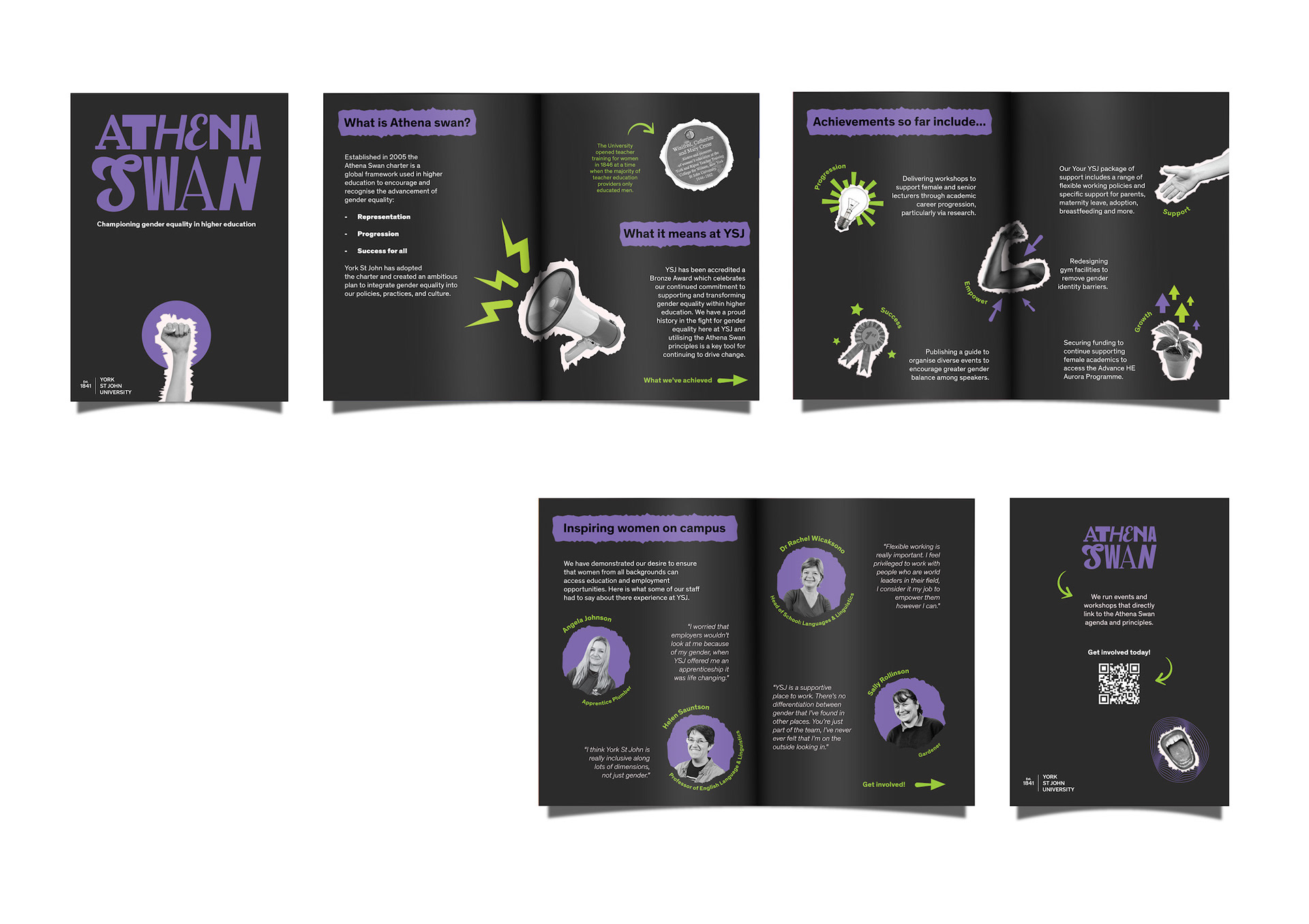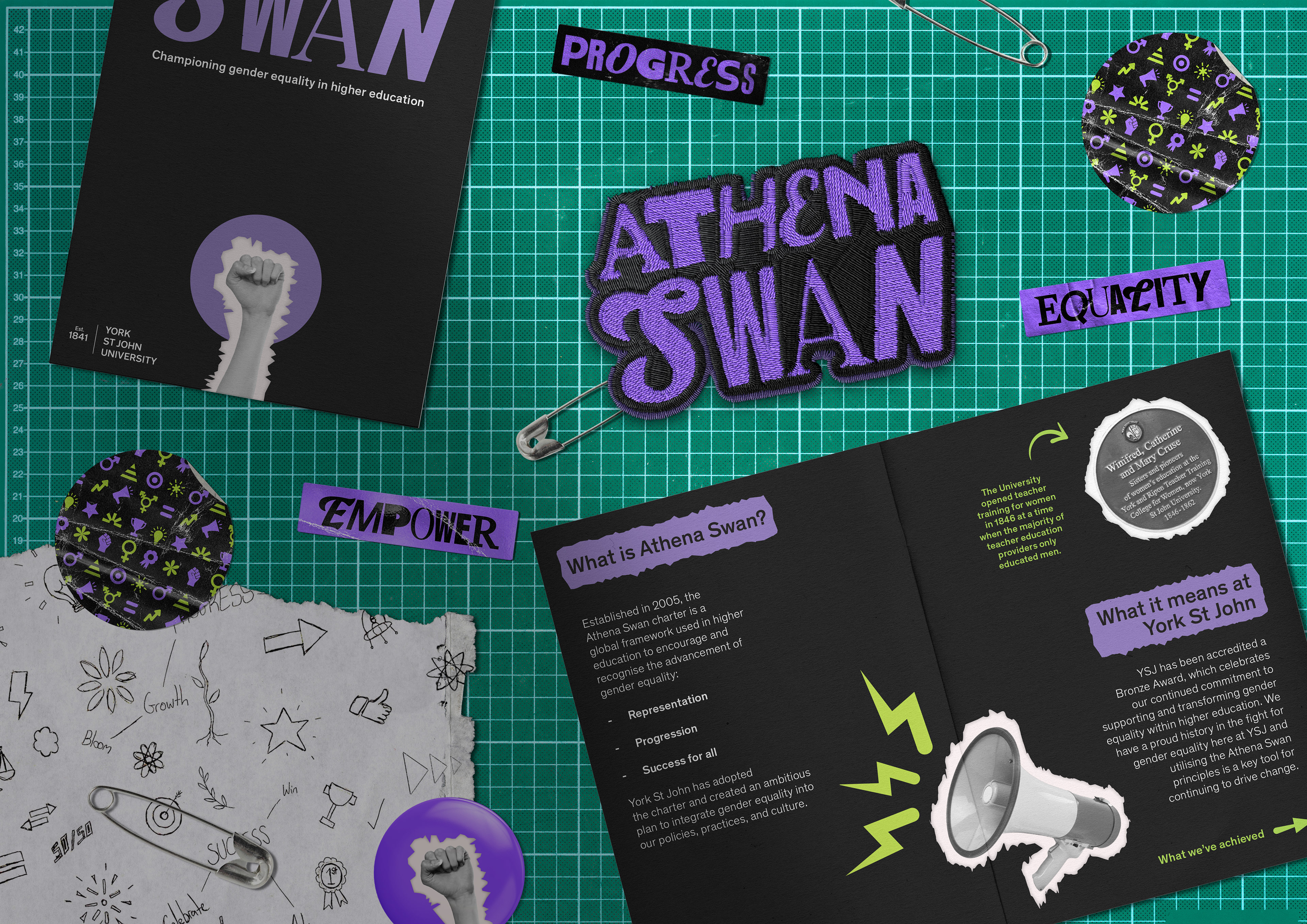
Athena Swan is a global framework supporting gender equality in higher education. This project was to develop a brand identity to promote and celebrate Athena Swan at York St John University, with the aim of encouraging greater engagement from staff and students.
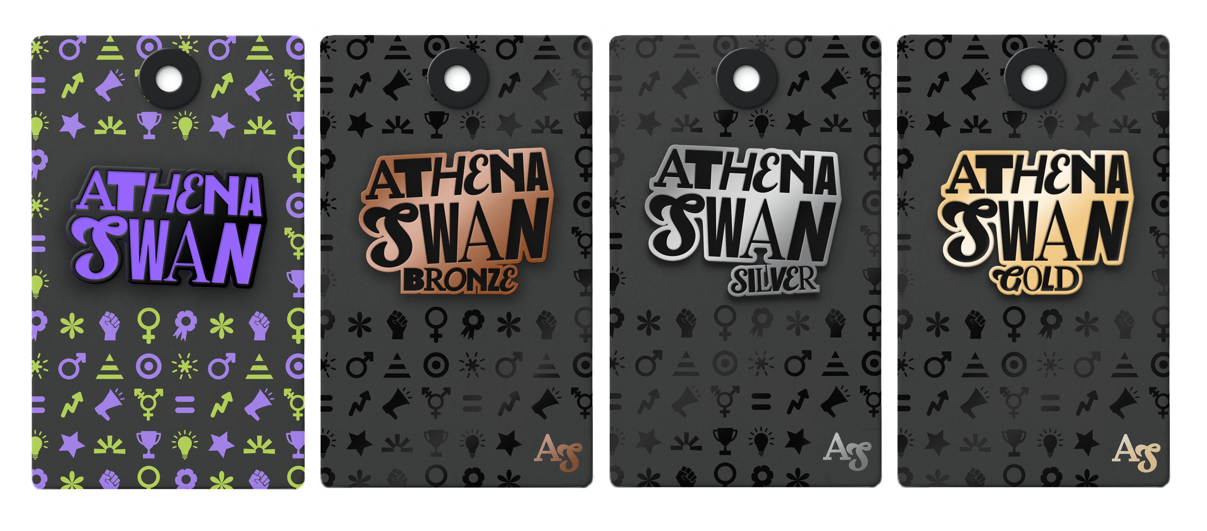
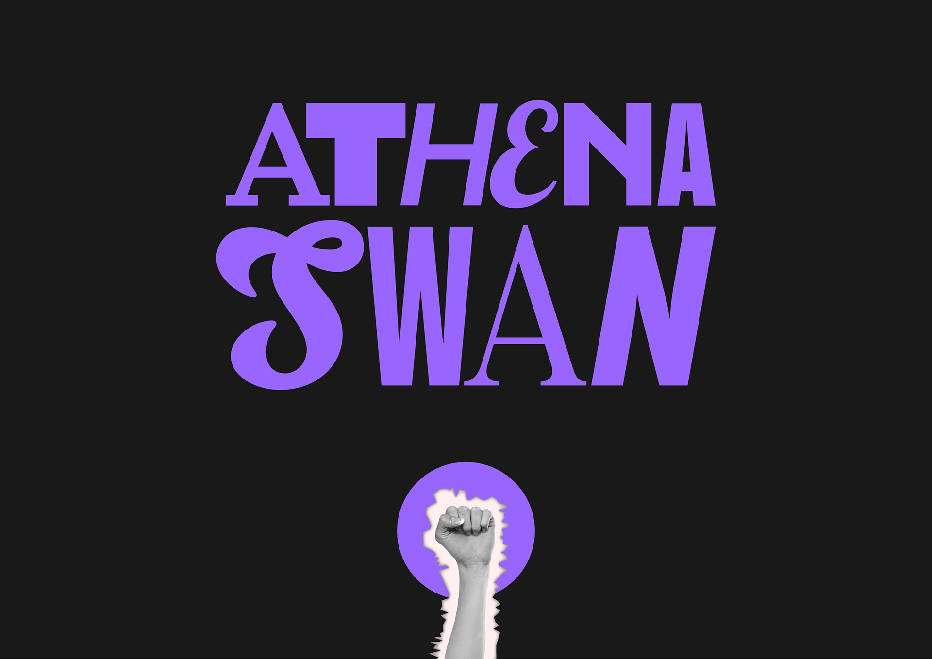
The logo uses a different typeface for each letter. Not only do these represent the ten academic subjects Athena Swan covers, but it also represents individuality for the diverse audience it serves. It demonstrates collaboration and shows how individuals can work together to achieve the same goals. The typefaces are designed by a mix of male and female type designers, enforcing what the brand stands for: gender equality.
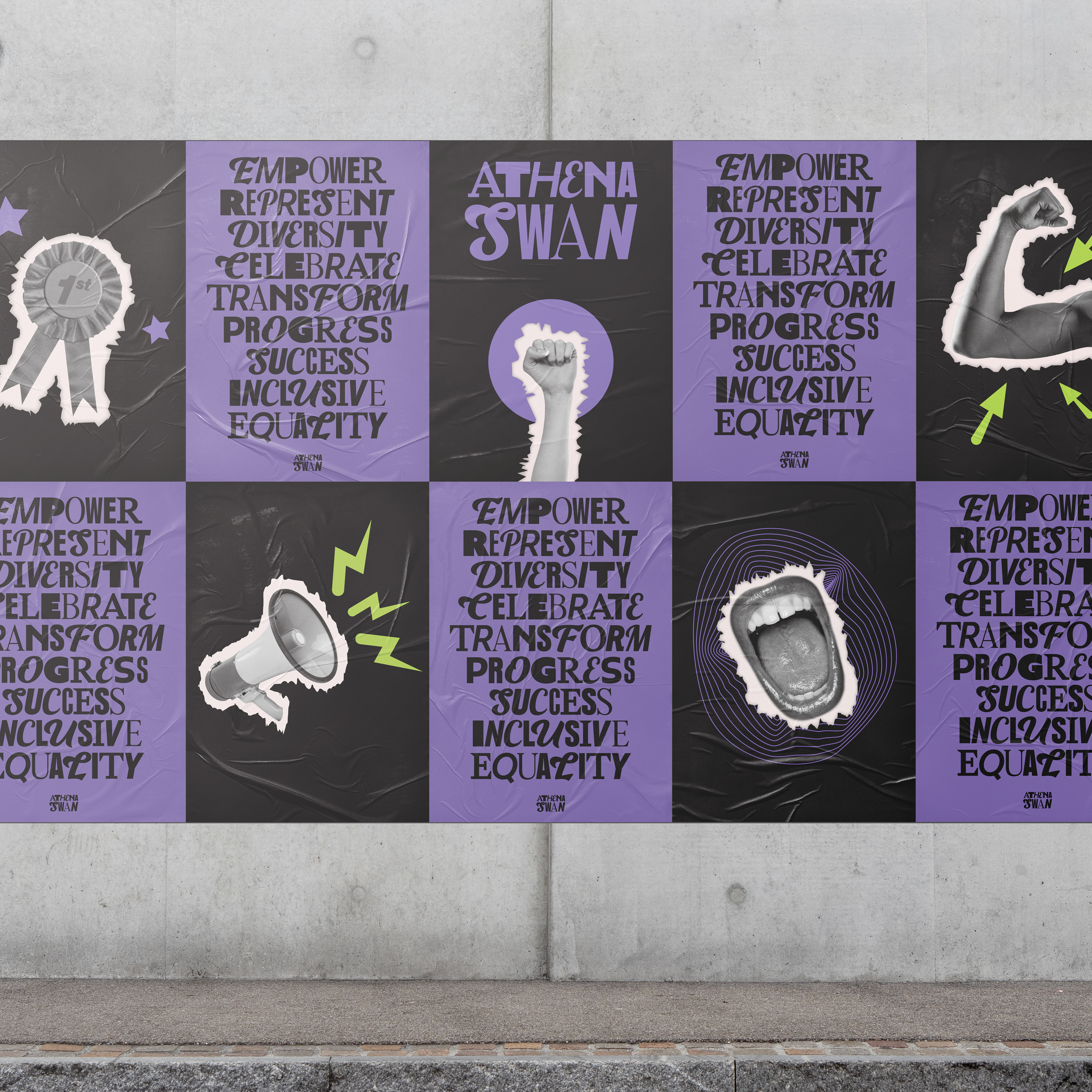
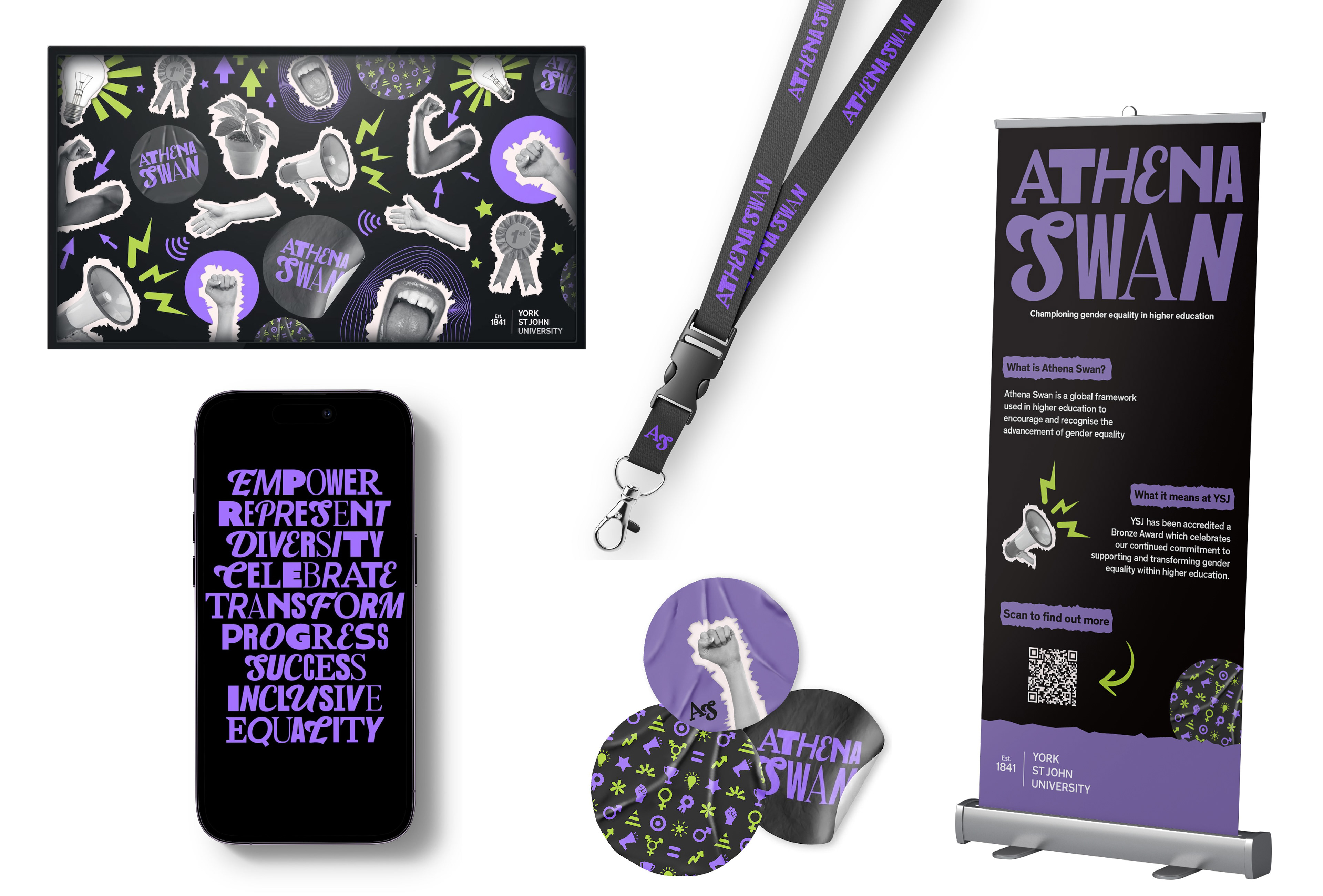
With a colour palette inspired by the suffragette movement and a design style influenced by the riot grrrl aesthetic, the branding was extended across zines, stickers, and patches to better connect with and engage the intended audience.